Many of our programmes perform intensive background tasks like data processing or networking. We often wish to show the status of the task in progress or an activity indicator. This week, we’ll discover how to use SwiftUI ProgressView to show both indeterminate and determined progress.
Place the SwiftUI ProgressView component anywhere in your layout to show undetermined progress. Let’s attempt it using a straightforward example.
struct ProgressViewClass: View {
    var body: some View {
        ProgressView()
    }
}
One may display a horizontal progress bar by binding SwiftUI’s ProgressView to a Double. This, for instance, generates a progress bar labelled “Downloading” with the text “downloadAmount” to indicate how full the progress bar ought to be:
struct ProgressViewClass: View {
    @State private var progressAmt = 10.0

    var body: some View {
        VStack {
            ProgressView("Loading....", value: progressAmt, total: 100)
        }
    }
}
In actuality, you’ll require a method of changing that number, such as a timer, network request, or other user interface. For instance, the following will gradually fill the progress bar .we can add the timer as well to show the downloading animation in the app. the animation of the progress View is shown below
struct ProgressViewClass: View {
    @State private var progressAmt = 0.0
    let time = Timer.publish(every: 0.1, on: .main, in: .common).autoconnect()

    var body: some View {
        ProgressView("Downloading…", value: progressAmt, total: 100)
            .onReceive(time) { _ in
                if progressAmt < 100 {
                    progressAmt += 2
                }
            }
    }
}
Sometimes we might wish to alter the progress view’s default tint colour. The target operating systems for which the programme will be made accessible will determine how to handle that. For illustration:
When using iOS 15 and later, we set a tint colour by giving the progress view the tint(🙂 view modifier. We must use the progressViewStyle(🙂 modifier with a CircularProgressViewStyle object as an input for earlier system versions. The tint hue is then given to the latter as support.
We may use an if #available statement, as is seen above, to simply handle each scenario. Note that if there is no requirement to support earlier system versions, then this is not required.
if #available(iOS 15.0, *) {
    ProgressView("downloading...")
        .tint(.blue)
} else {
    ProgressView("downloading...")
        .progressViewStyle(CircularProgressViewStyle(tint: .blue))
}
We can use the foregroundColor modifier to alter the colour of the label as well:
ProgressView("Loading...")
    .tint(.green)
    .foregroundColor(.red)
In addition to the examples above that show how the indeterminate progress view is often used, it is also possible to supply and display any other SwiftUI view in place of only a text as a parameter. The next generates a task-stopping button in a progress view that shows the status of the task. The label for the progress view is now that button:
Circular SwiftUI progress bar creation instructions
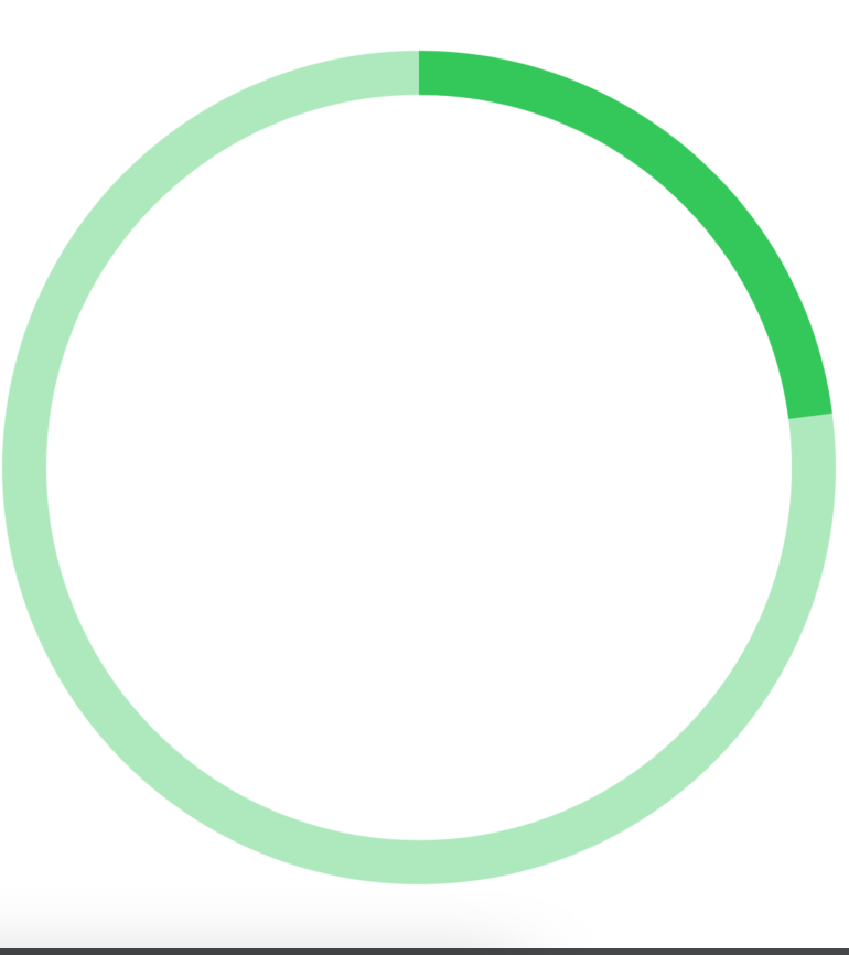
To create a circular progress view using SwiftUI, we just need three views.
- Circle view serves as the background while no progress is being made.
- A second Circle perspective is superimposed on the first. This will serve to illustrate progress.
- The second Circle view will be laid down on top of the previous Circle view using ZStack.
- Our circular progress bar’s static view will be created first.
Then, using data on progress, we will make it display progress.

struct ProgressViewClass: View {
    var body: some View {
          ZStack {
              Circle()
                  .stroke(
                      Color.green.opacity(0.4),
                      lineWidth: 20
                  )
              Circle()
                  .trim(from: 0, to: 0.23) // 1
                  .stroke(
                      Color.green,
                      lineWidth: 20
                  ).rotationEffect(.degrees(-90))

          }.padding()
      }
}